Style Guide
Visual Direction
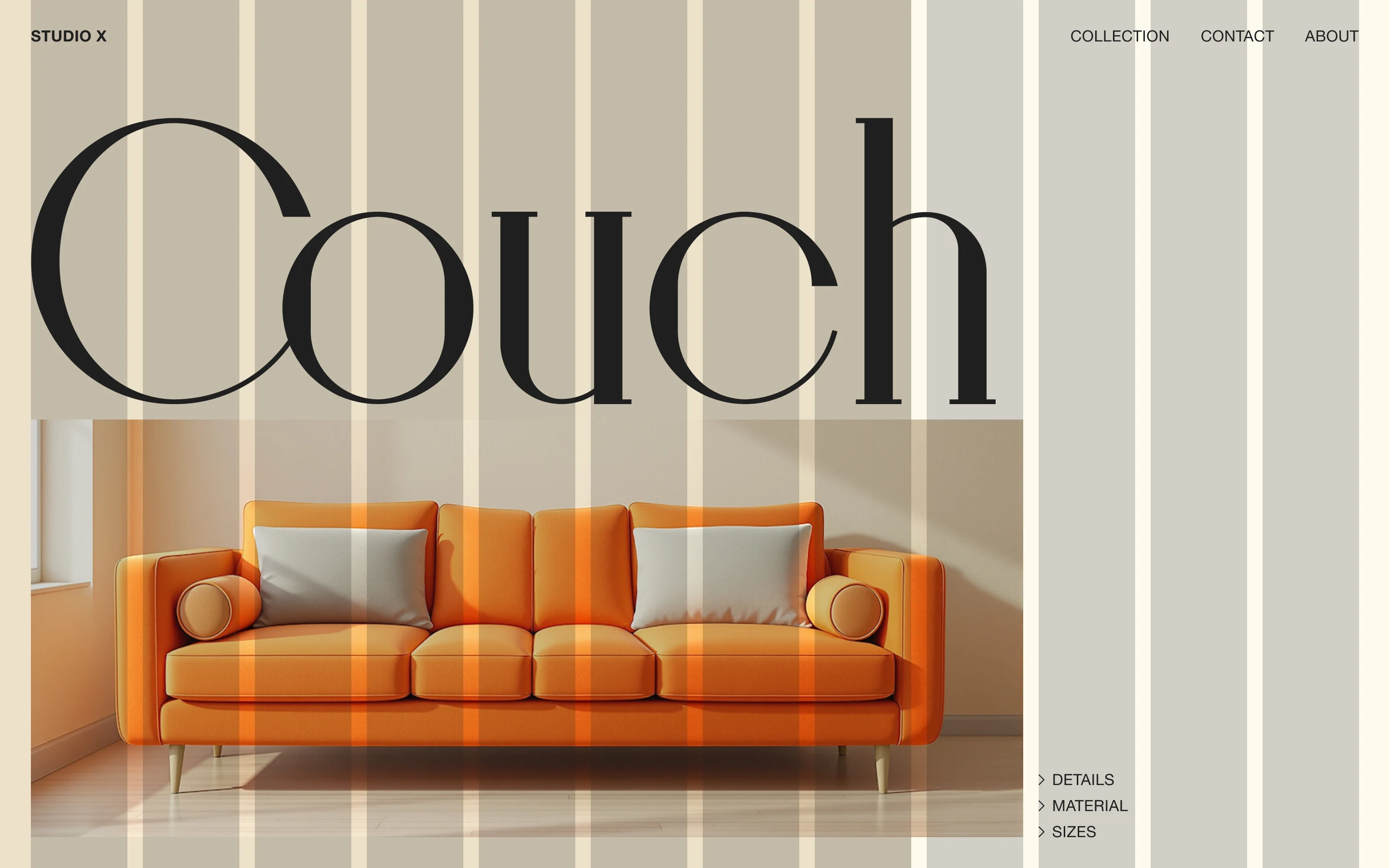
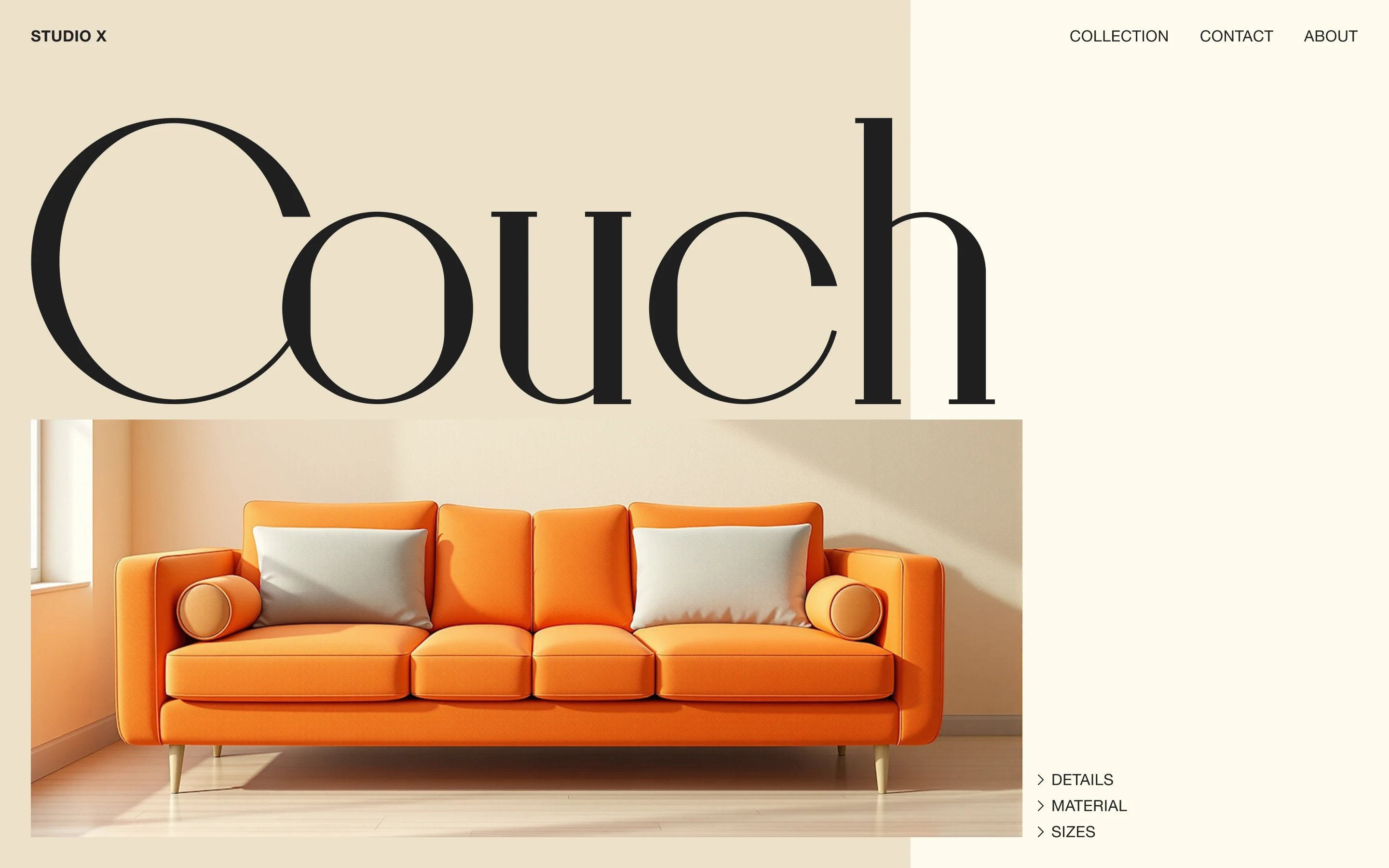
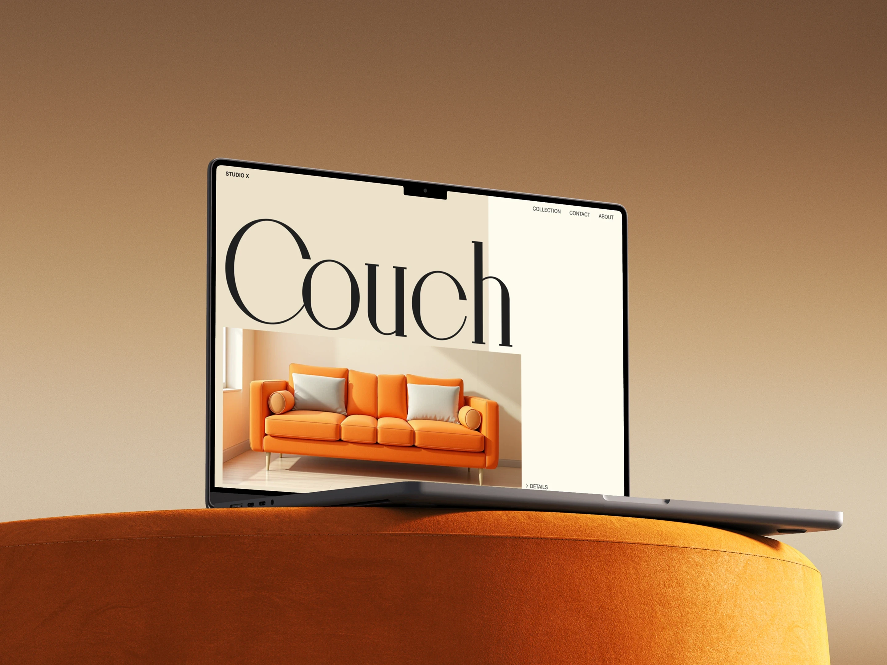
The layout started with typography. I wanted the headline to feel almost as present as the product itself, using scale and overlap to give the page a strong editorial character. Once the structure was set, I chose the couch and built the colour palette around it, keeping the rest of the page quiet so the image could stand out. The split background creates a separate space for the links on the right, giving that part of the layout its own place without adding another visible container.
Typography
Bigilla
Aa Bb Cc Dd Ee Ff Gg Hh Ii Jj Kk Ll Mm Nn Oo Pp Qq Rr Ss Tt Uu Vv Ww Xx Yy Zz 1234567890&#$€%@!?*
Helvetica Neue
Aa Bb Cc Dd Ee Ff Gg Hh Ii Jj Kk Ll Mm Nn Oo Pp Qq Rr Ss Tt Uu Vv Ww Xx Yy Zz 1234567890&#$€%@!?*
Color
#202020
#EDE1CB
#FDFBEF
Grid
Columns
12
Gutter
16 px
Margin
32 px