Style Guide
Visual Direction
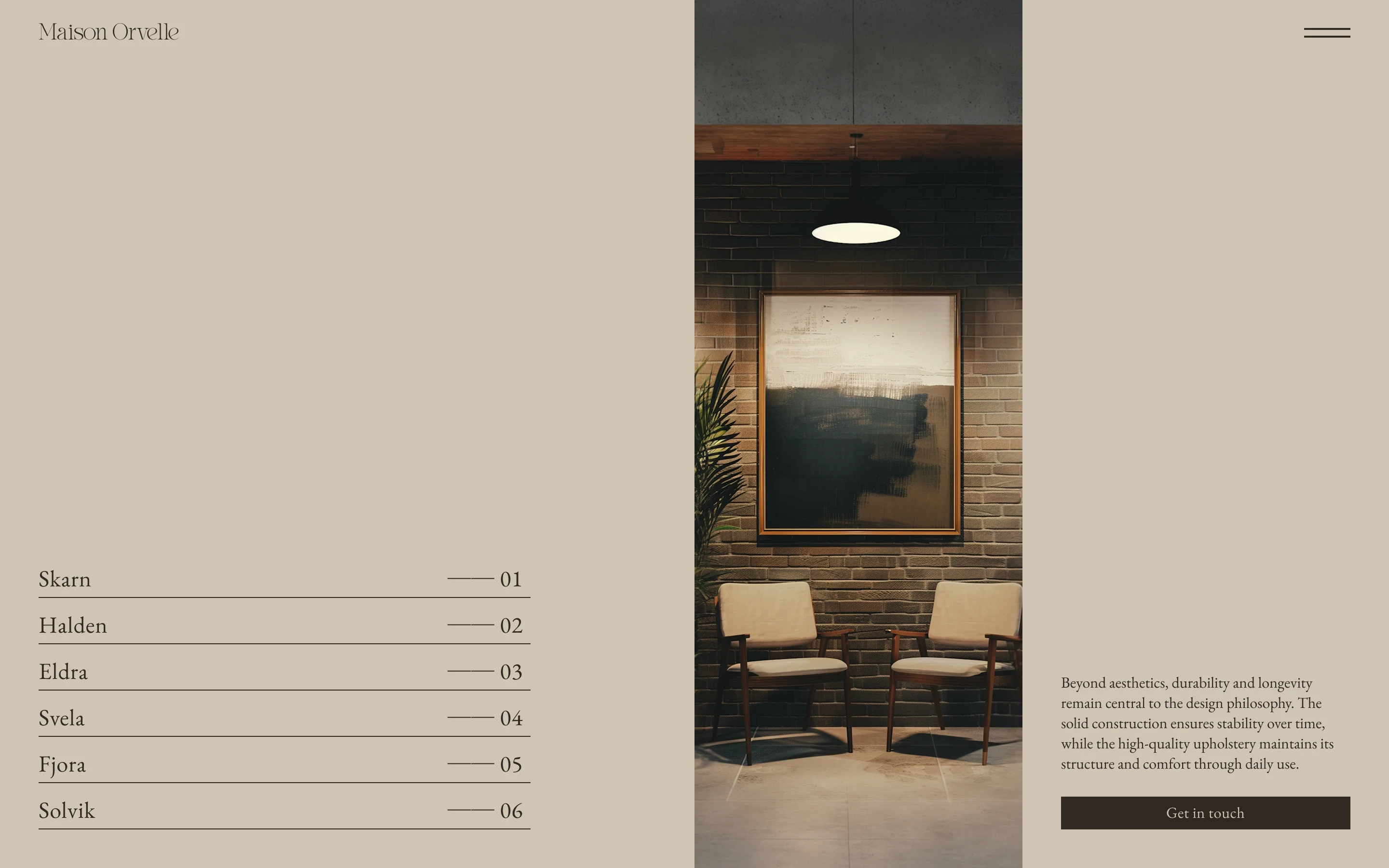
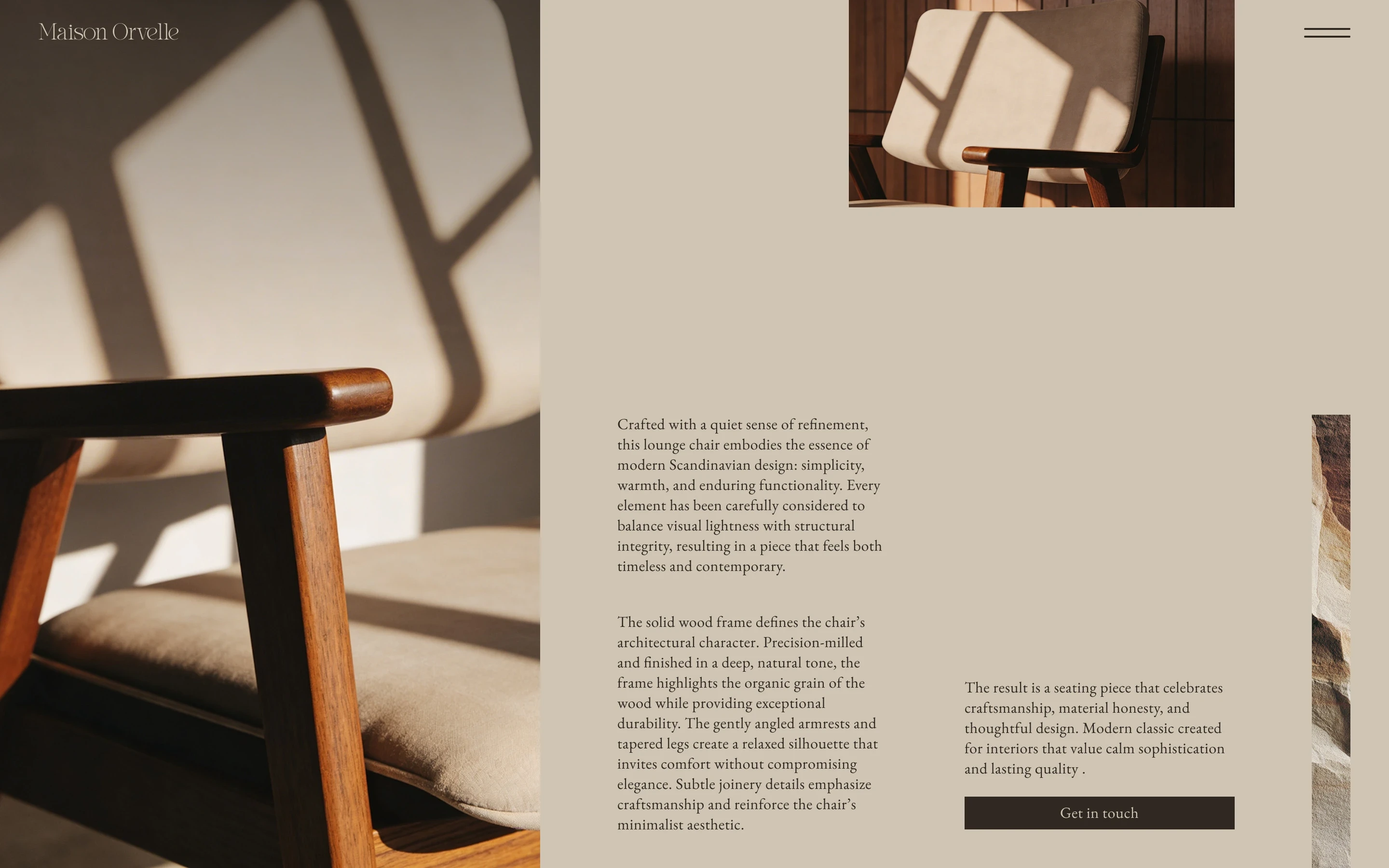
The composition was built around contrast. Large serif words create the main visual anchors, while smaller sans-serif text connects them and gives the layout a more varied rhythm. The images are placed directly within the typography so both elements feel like one composition, interrupting the larger words rather than sitting beside them. A dark brown background keeps everything focused in the centre and gives the lighter type and warm imagery enough contrast to stand out.
Typography
Bigilla
Aa Bb Cc Dd Ee Ff Gg Hh Ii Jj Kk Ll Mm Nn Oo Pp Qq Rr Ss Tt Uu Vv Ww Xx Yy Zz 1234567890&#$€%@!?*
Helvetica Neue
Aa Bb Cc Dd Ee Ff Gg Hh Ii Jj Kk Ll Mm Nn Oo Pp Qq Rr Ss Tt Uu Vv Ww Xx Yy Zz 1234567890&#$€%@!?*
Color
#38271F
#F0F0F0
Grid
Columns
12
Gutter
16 px
Margin
40 px