Style Guide
Visual Direction
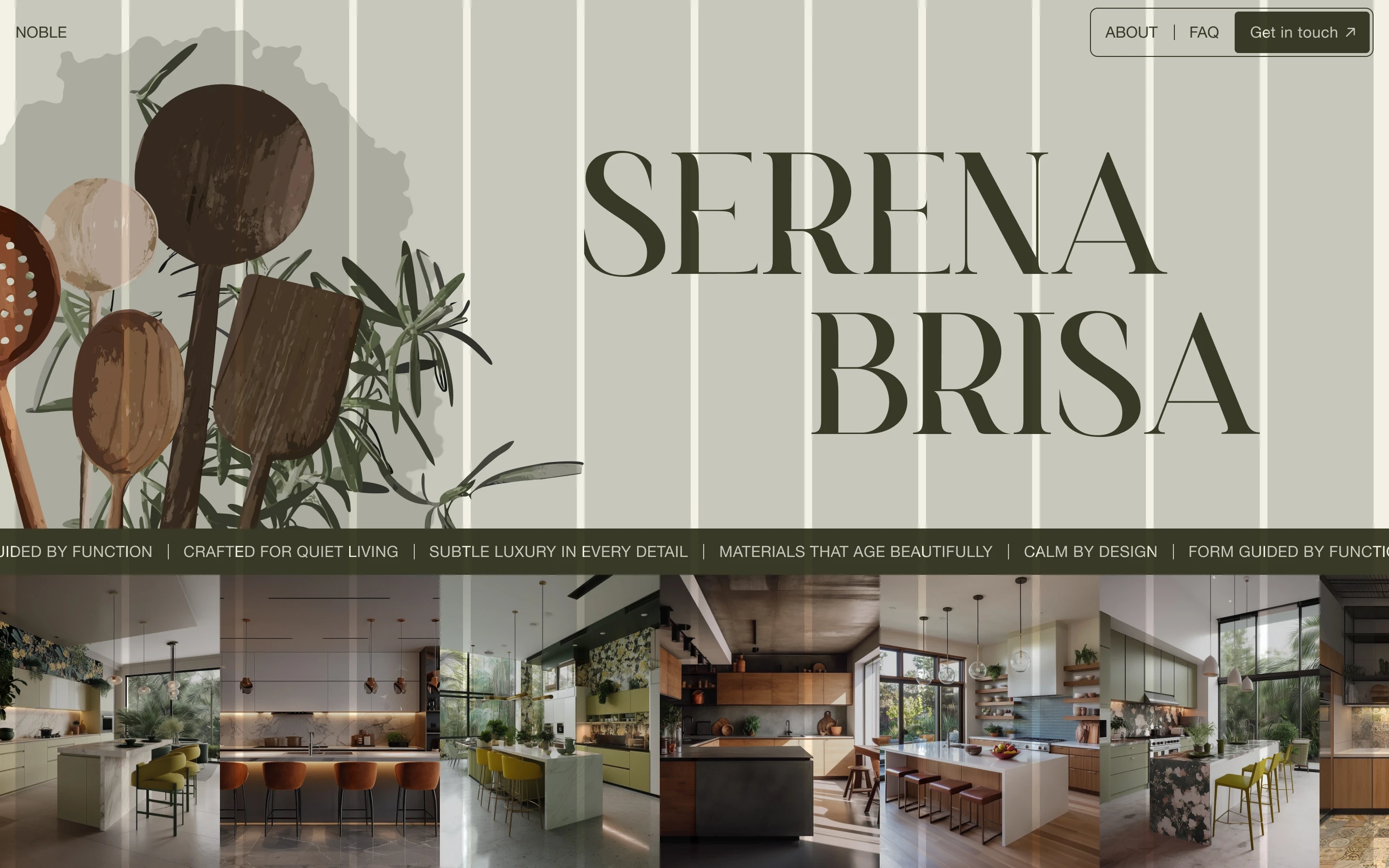
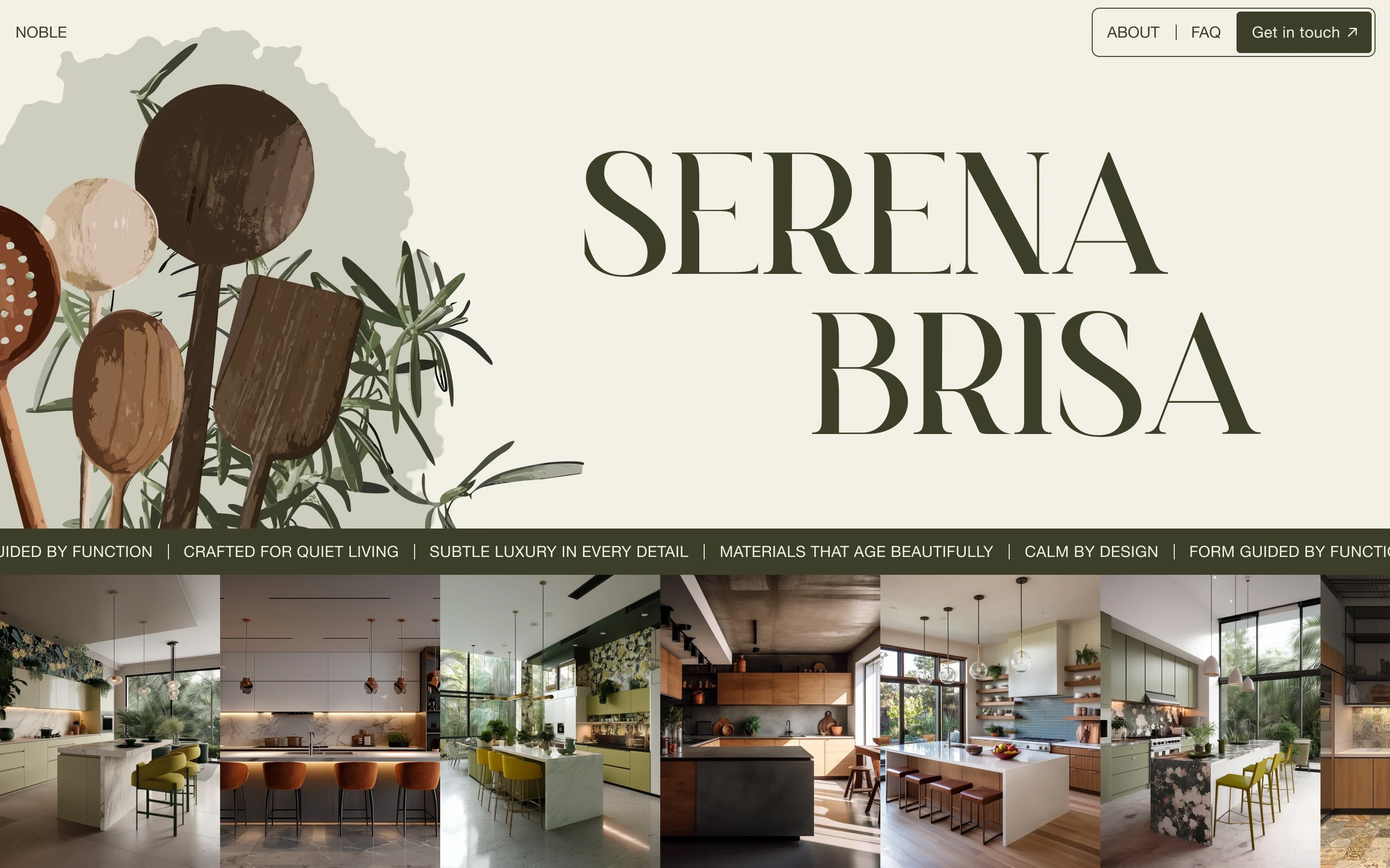
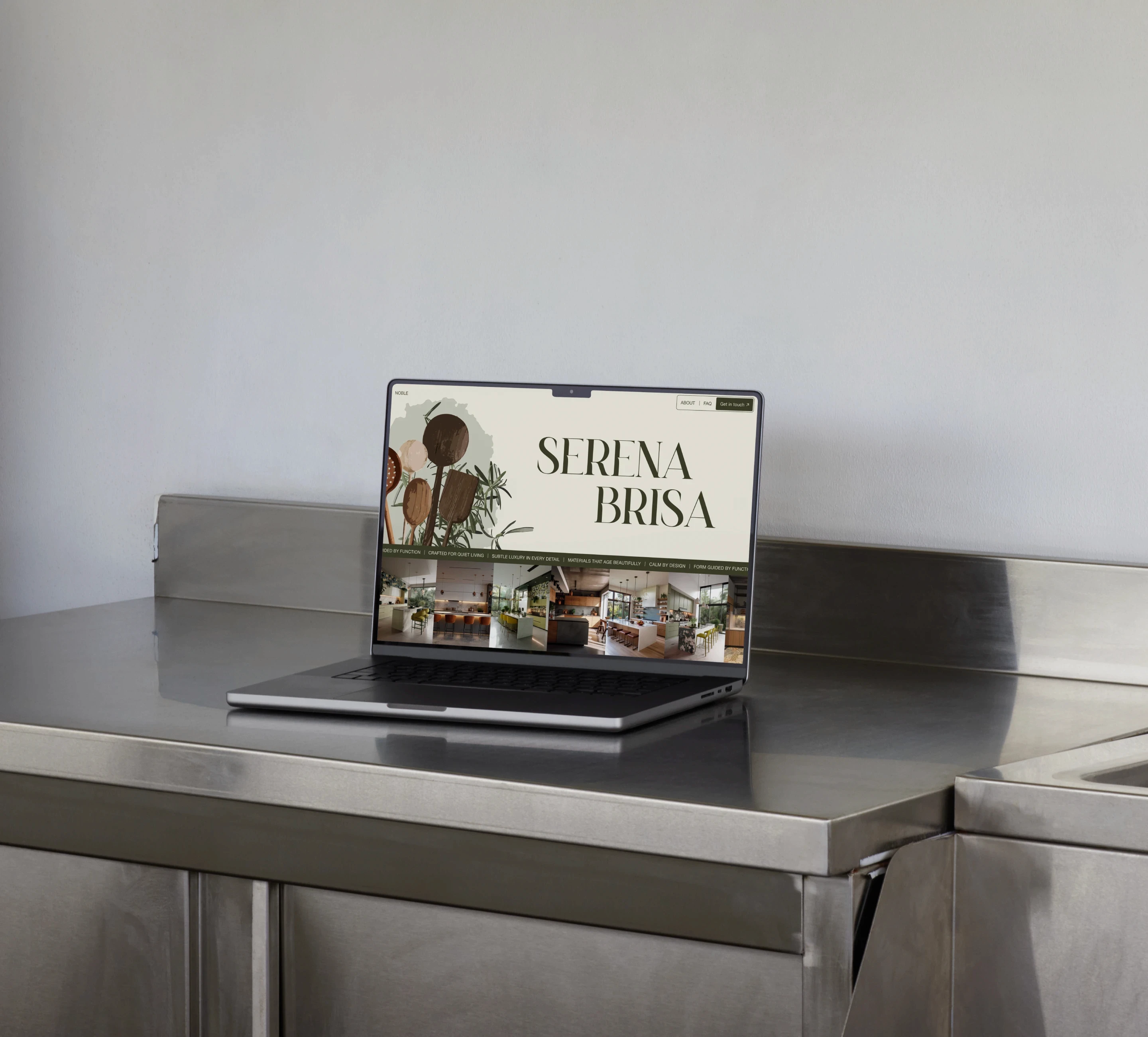
The layout is built around warmth and contrast. Illustrated kitchen utensils were placed alongside clean interior photography to soften the sharper lines of the spaces and give the page a more relaxed, expressive mood. The large serif headline adds a sense of quiet luxury, while the warm, saturated palette ties the different elements together. A horizontal text band separates the hero from the gallery below and introduces a subtle layer of motion, moving against the image ticker to create a calmer, more considered rhythm.
Typography
Moniko
ABcdefghijklmnopqrstuvwxyz1234567890&#$€%@!?*
Helvetica Neue
Aa Bb Cc Dd Ee Ff Gg Hh Ii Jj Kk Ll Mm Nn Oo Pp Qq Rr Ss Tt Uu Vv Ww Xx Yy Zz 1234567890&#$€%@!?*
Color
#3E3F29
#F1F0E4
Grid
Columns
12
Gutter
8 px
Margin
16 px