Style Guide
Visual Direction
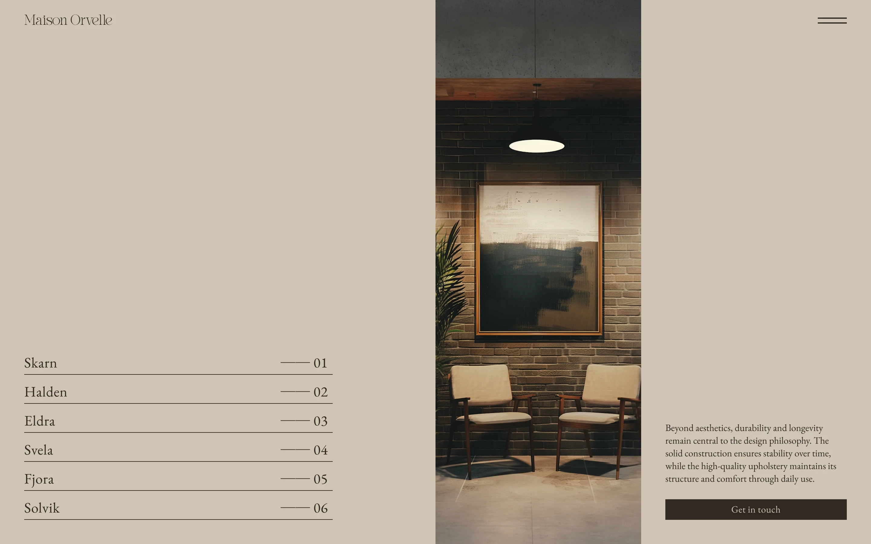
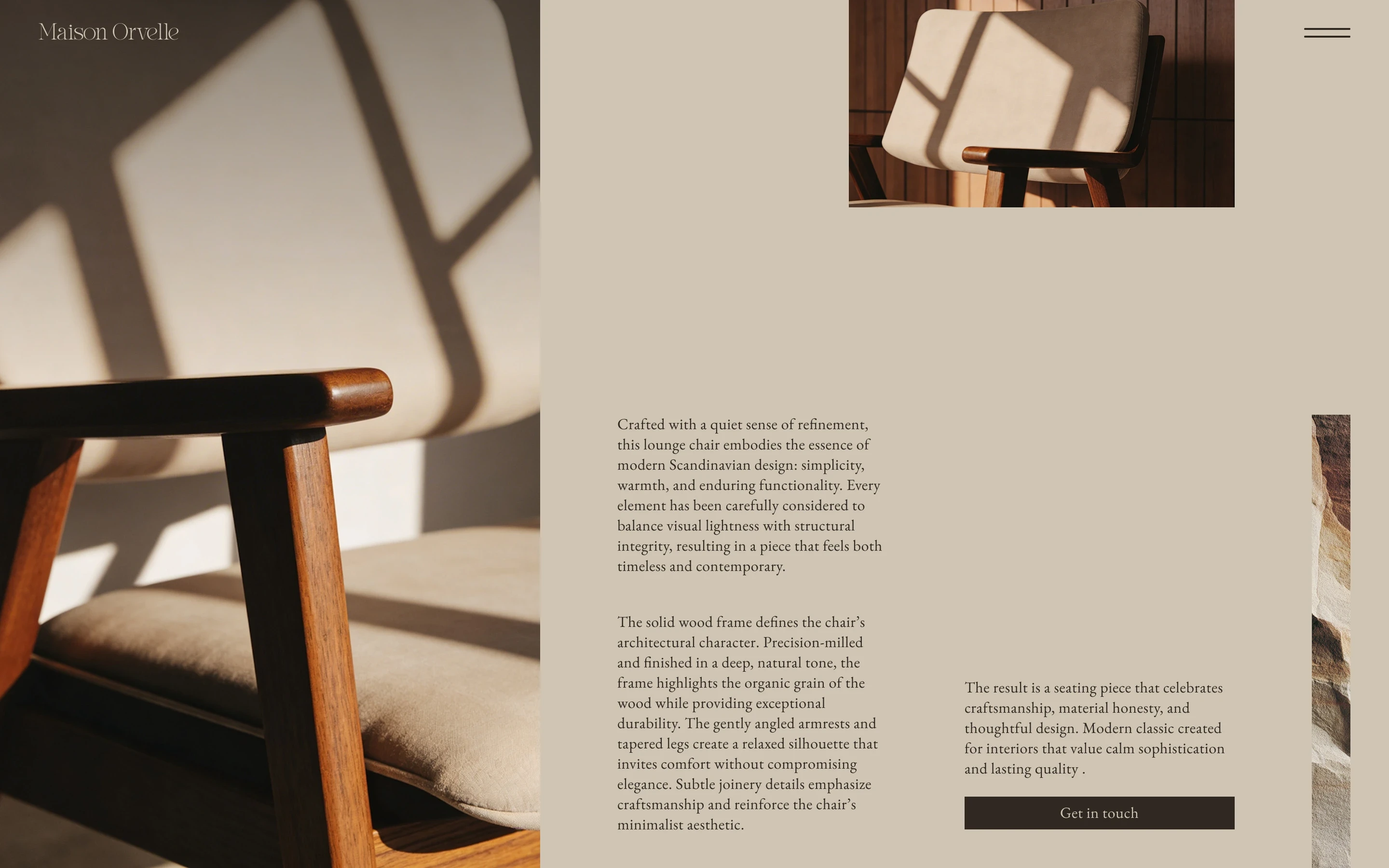
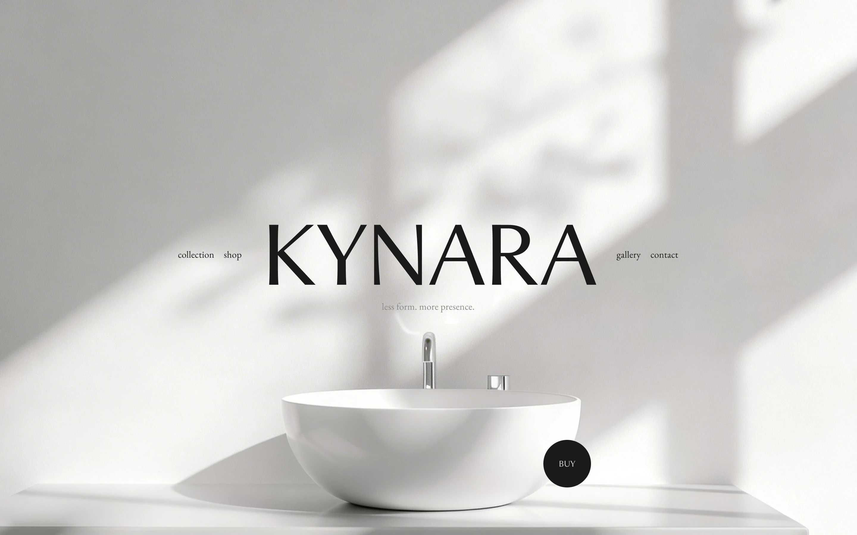
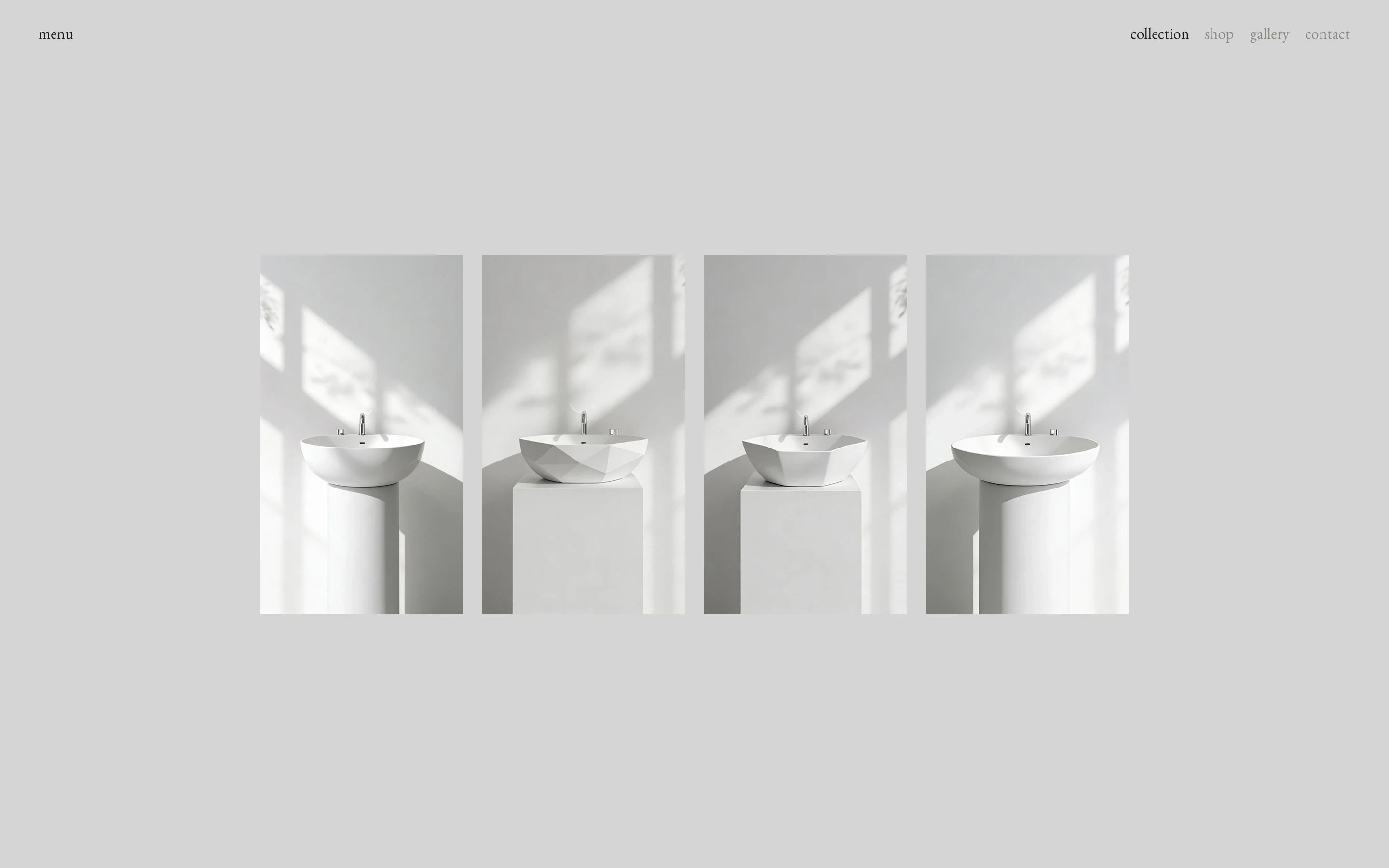
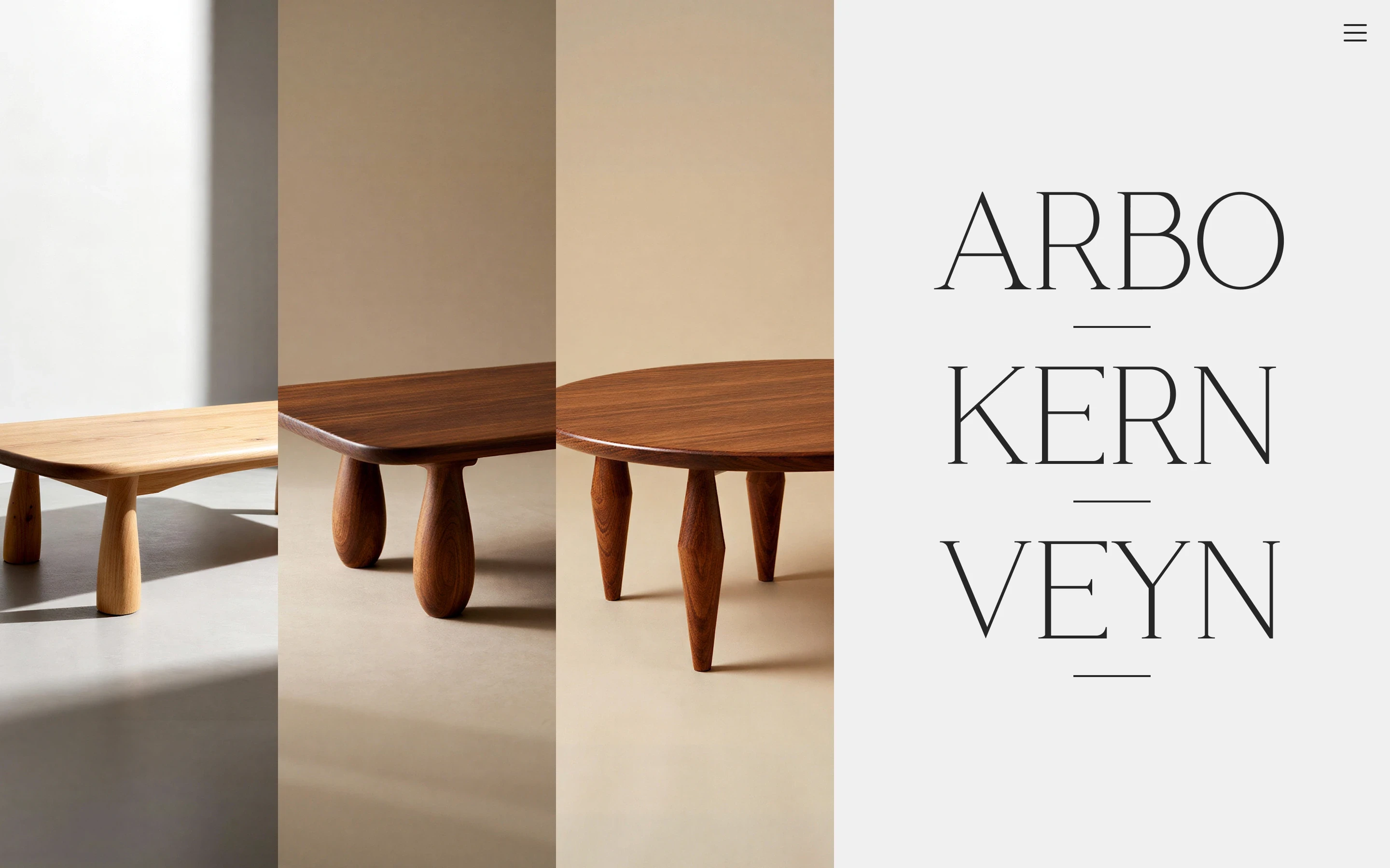
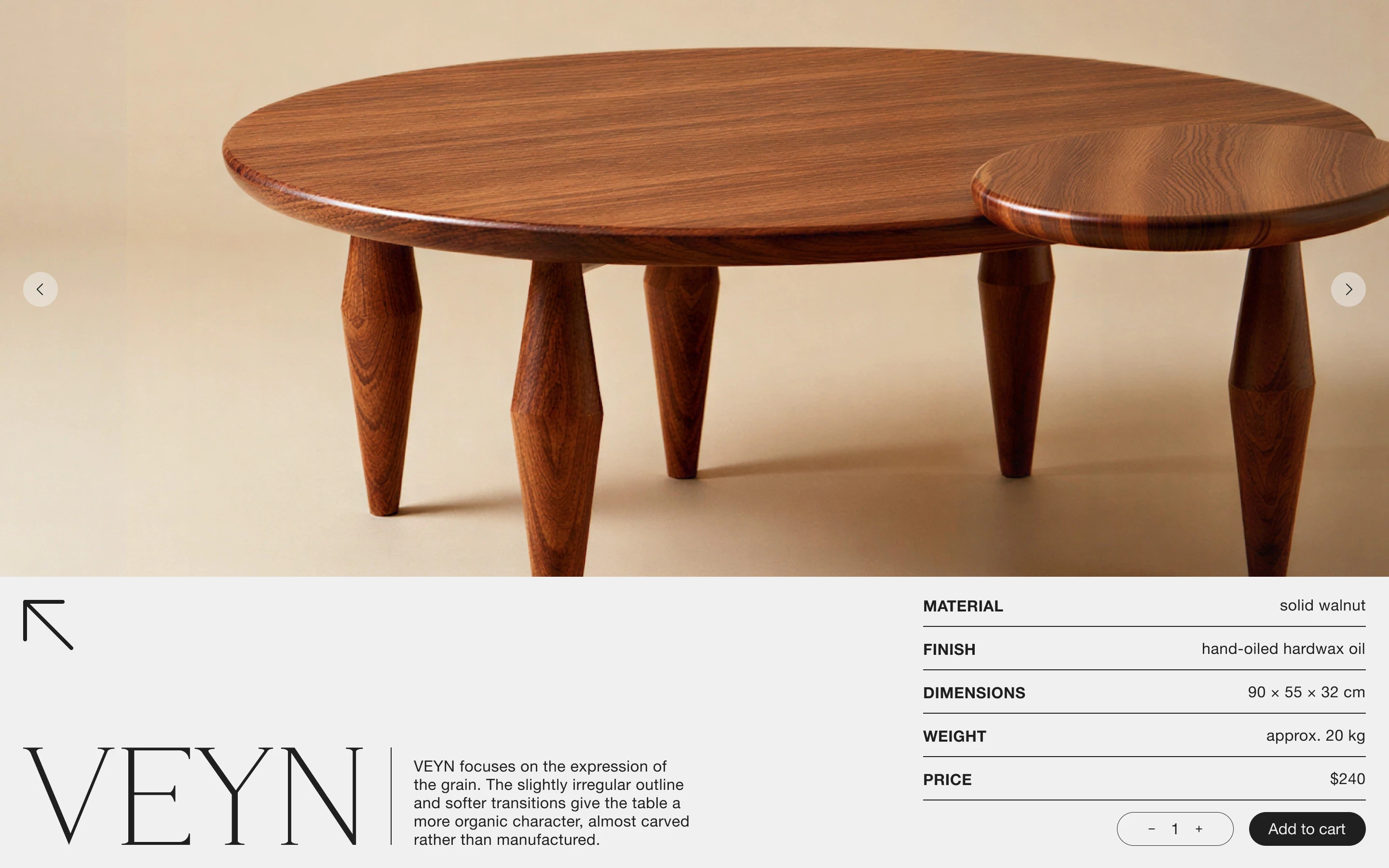
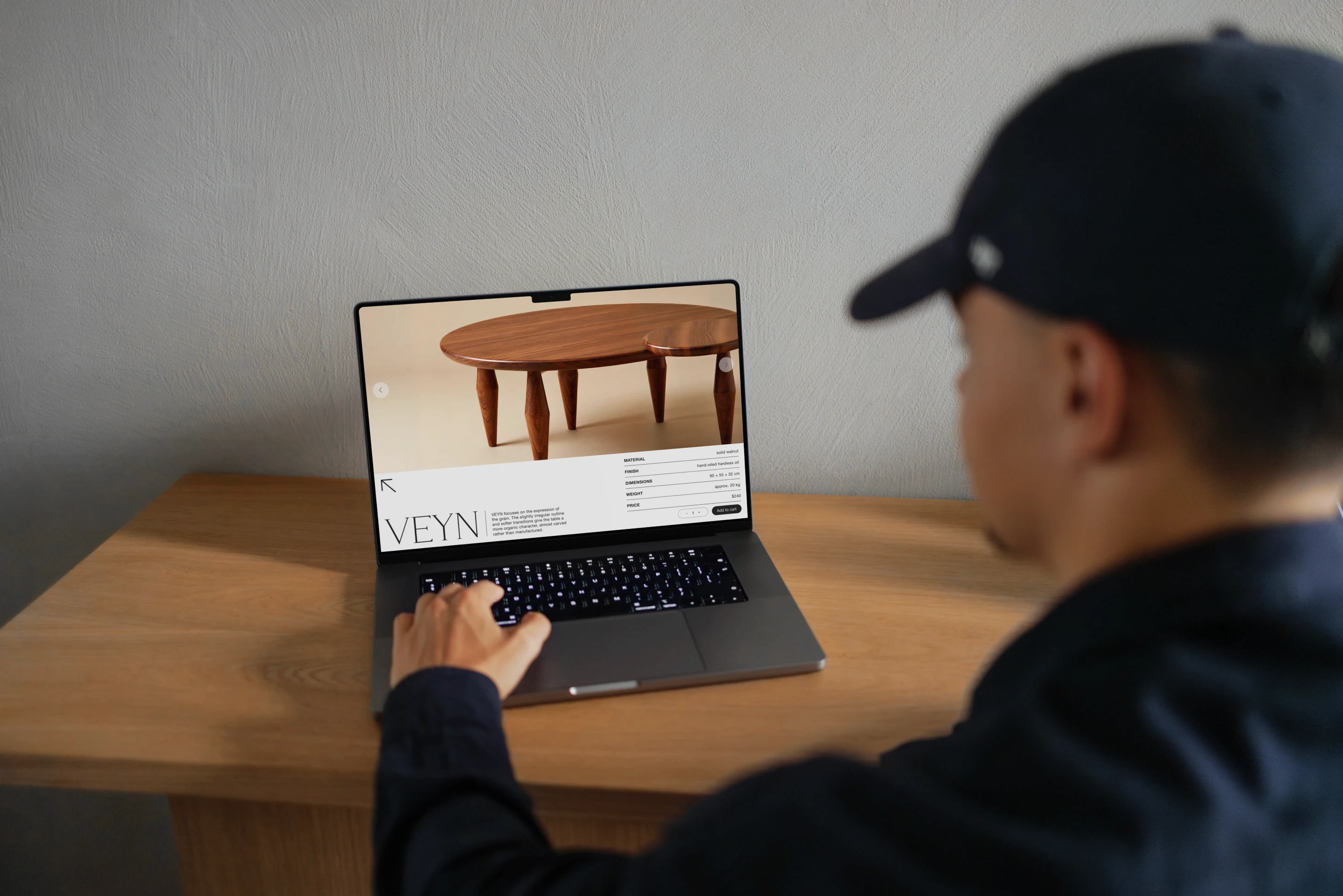
The visual direction is built around simplicity and focus. Large product imagery does most of the work, while the surrounding interface stays deliberately minimal and neutral. On the overview, the three products are given enough space to stand apart, with hover interactions bringing each one forward without adding extra clutter. On the product page, the information comes first. Material, finish, dimensions, weight, price and purchase options are organised clearly before the layout adds any visual character around them.
Typography
Kinta
Aa Bb Cc Dd Ee Ff Gg Hh Ii Jj Kk Ll Mm Nn Oo Pp Qq Rr Ss Tt Uu Vv Ww Xx Yy Zz 1234567890&#$€%@!?*
Helvetica Neue
Aa Bb Cc Dd Ee Ff Gg Hh Ii Jj Kk Ll Mm Nn Oo Pp Qq Rr Ss Tt Uu Vv Ww Xx Yy Zz 1234567890&#$€%@!?*
Color
#202020
#F0F0F0
Grid
Columns
12
Gutter
8 px
Margin
24 px