Style Guide
Visual Direction
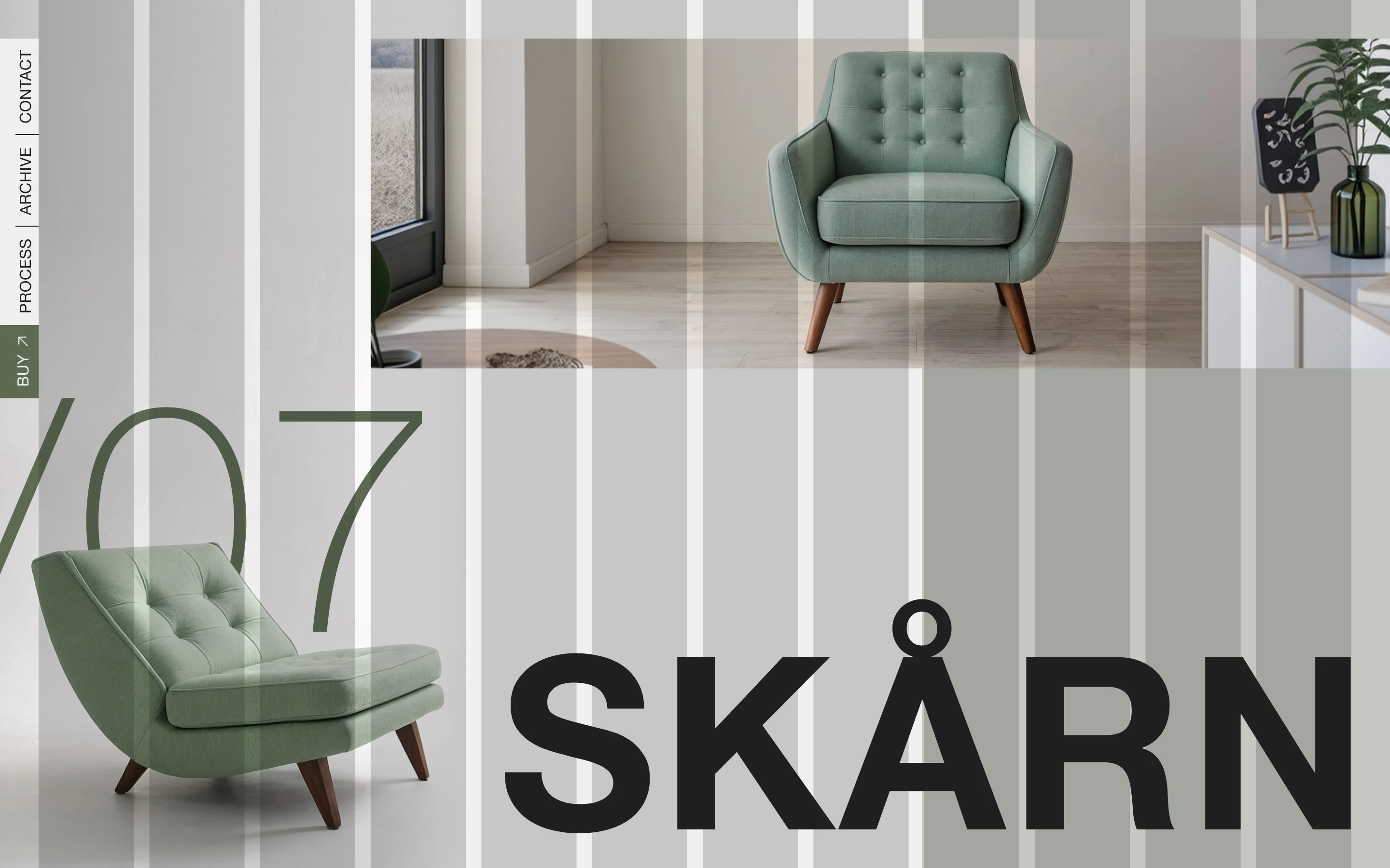
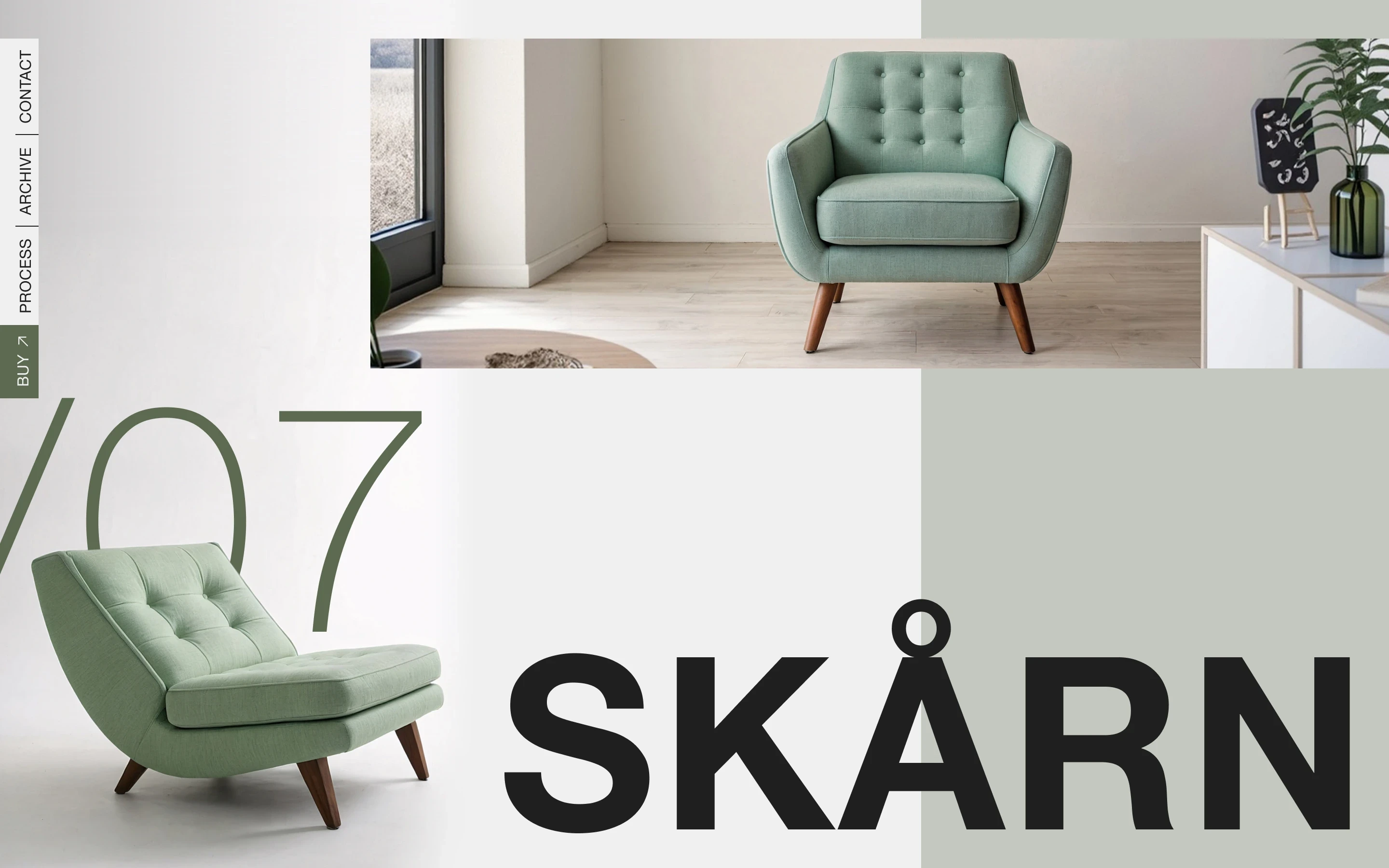
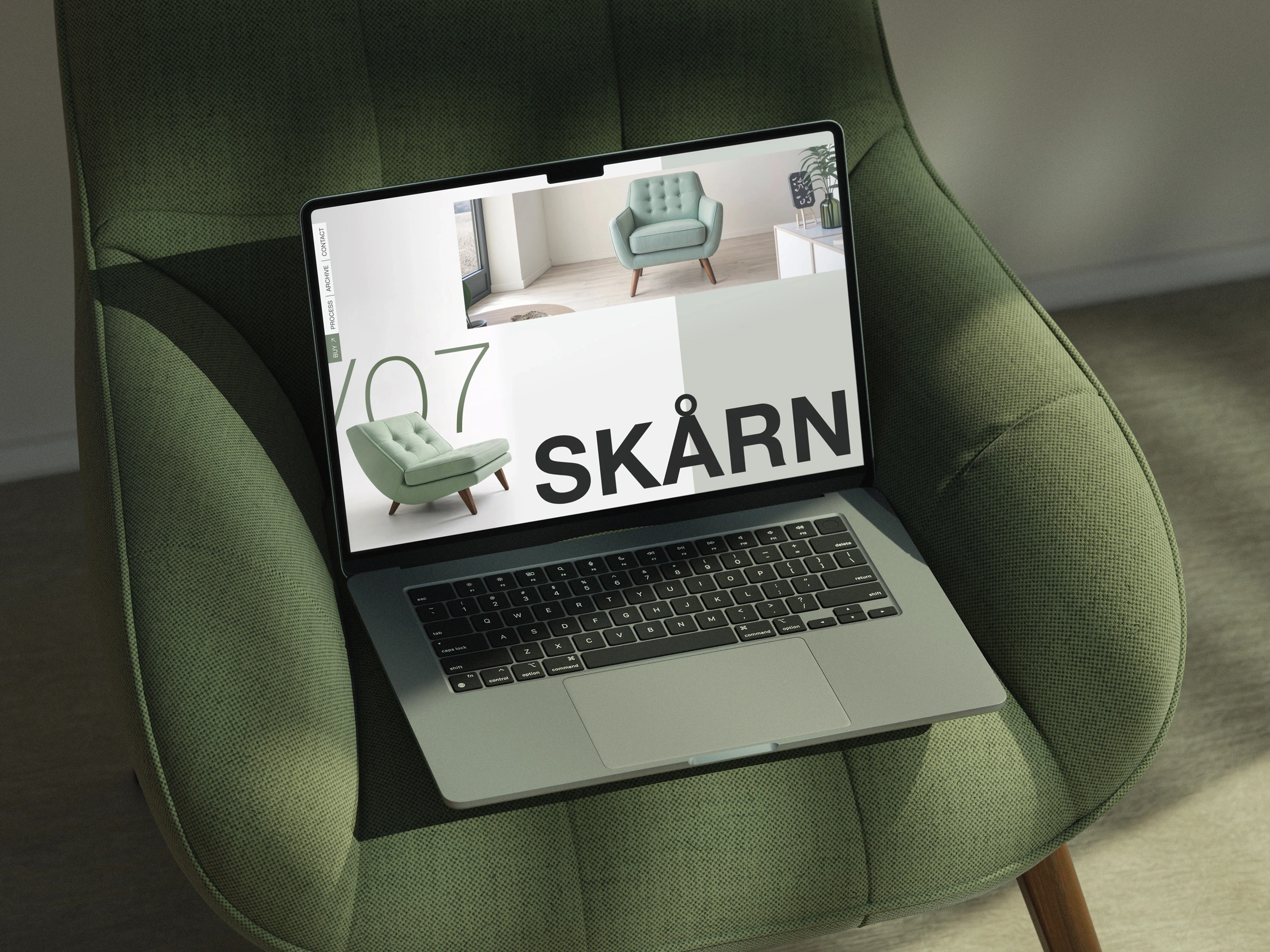
The composition is built around depth and hierarchy. The oversized /07 sits behind the chair to make the product feel more spatial and tangible, while its thin weight keeps it from competing with the main title. SKÅRN takes the opposite approach, using a much heavier weight to clearly establish the primary heading. Overlapping colour blocks and imagery structure the page and give the upper image more emphasis, while the vertical navigation becomes a graphic element in its own right along the left edge.
Typography
Helvetica Neue
Aa Bb Cc Dd Ee Ff Gg Hh Ii Jj Kk Ll Mm Nn Oo Pp Qq Rr Ss Tt Uu Vv Ww Xx Yy Zz 1234567890&#$€%@!?*
Color
#5C6A51
#C4C8C0
#202020
#F0F0F0
Grid
Columns
12
Gutter
16 px
Margin
40 px