Style Guide
Visual Direction
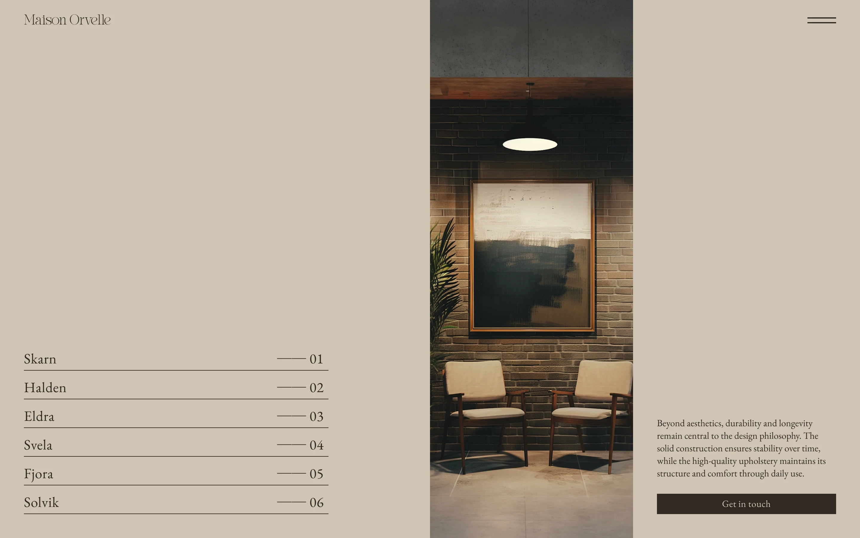
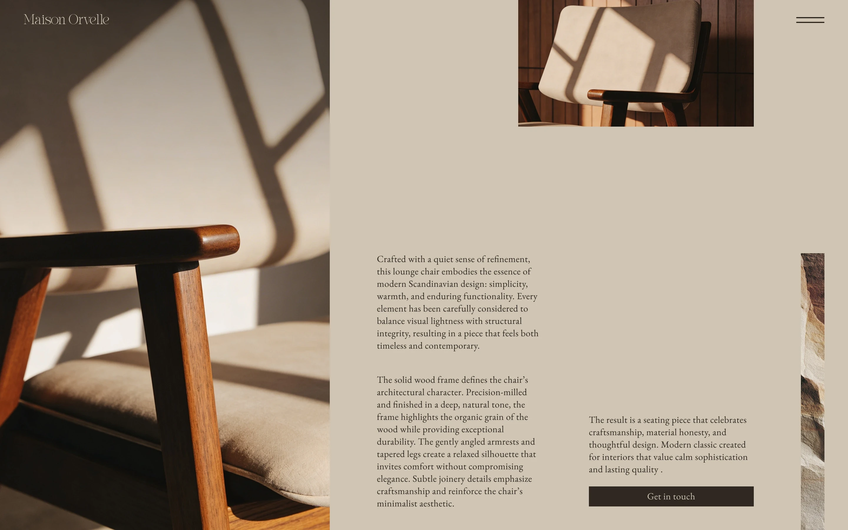
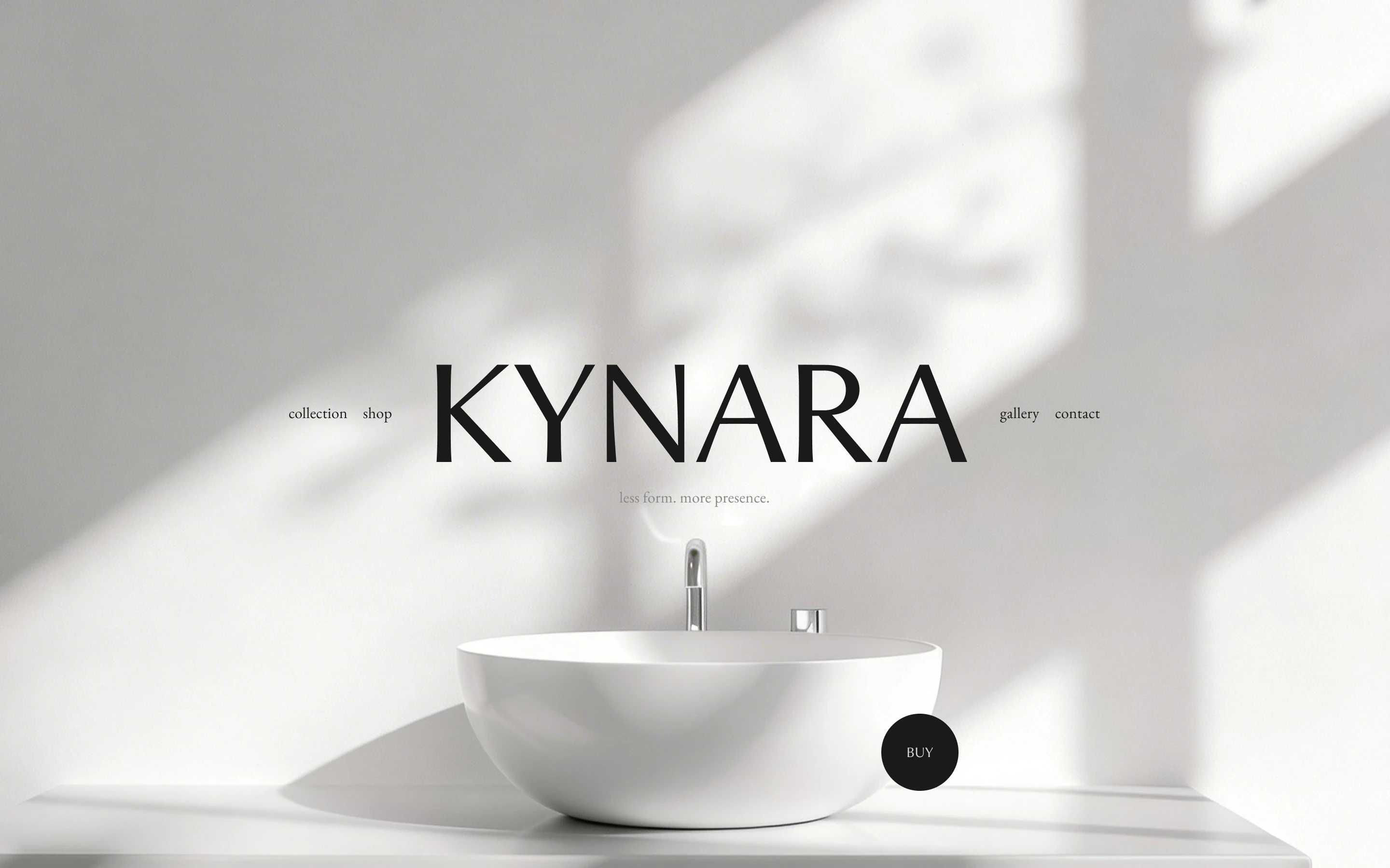
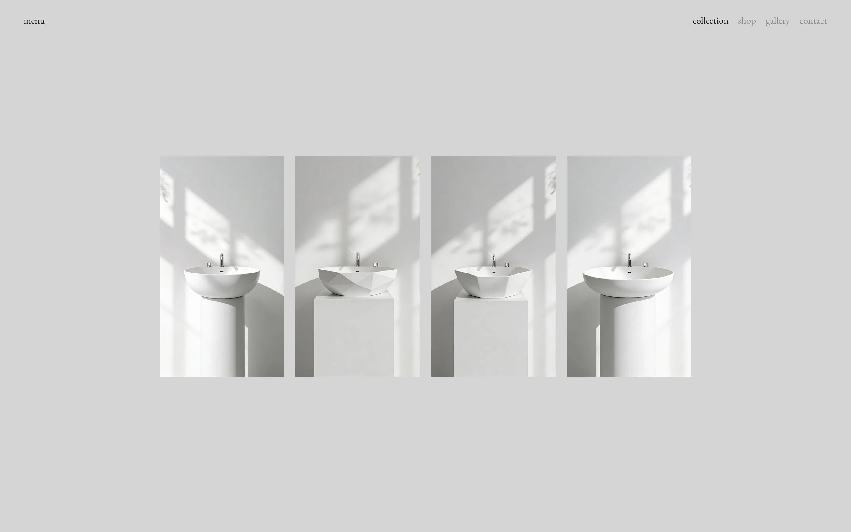
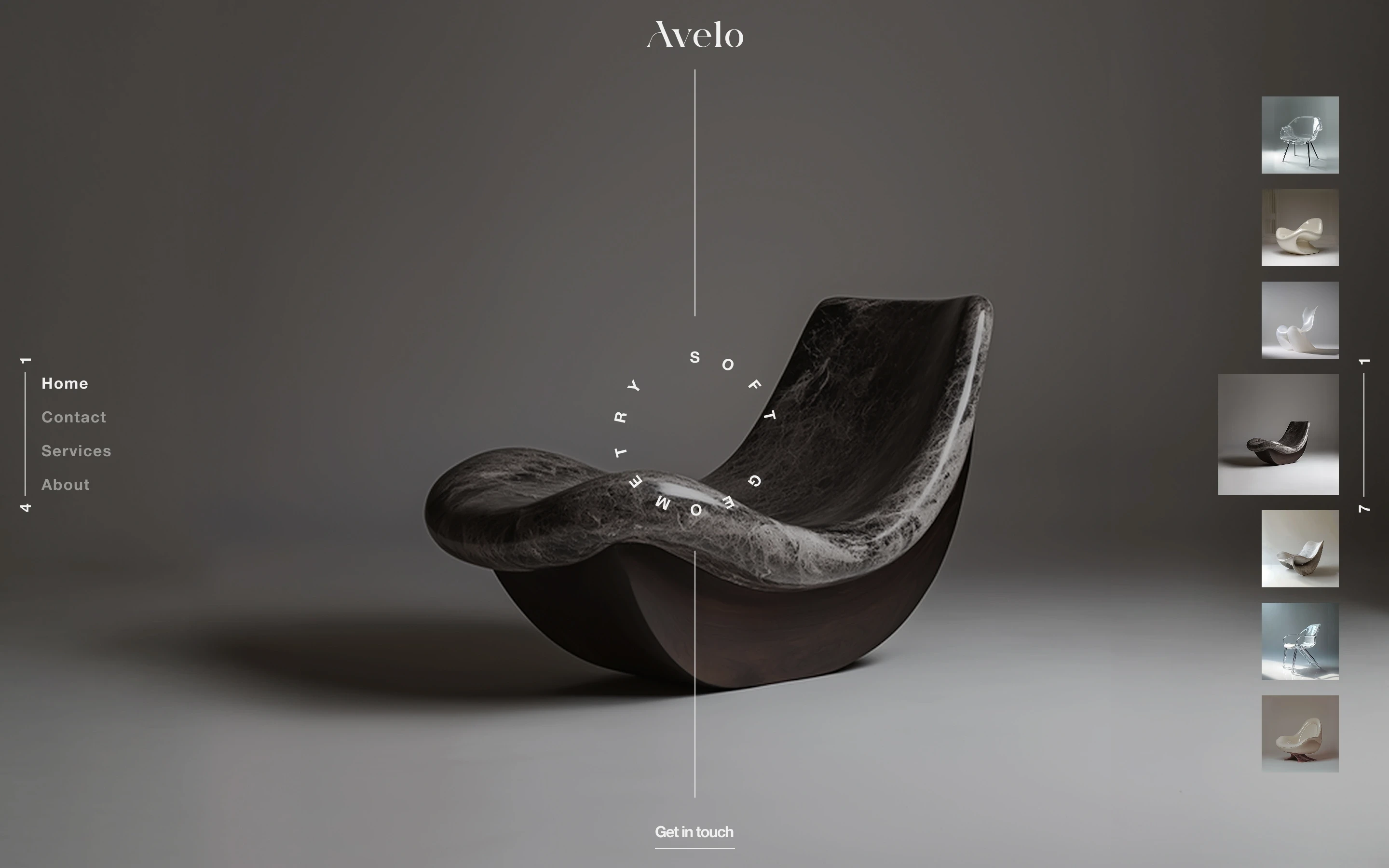
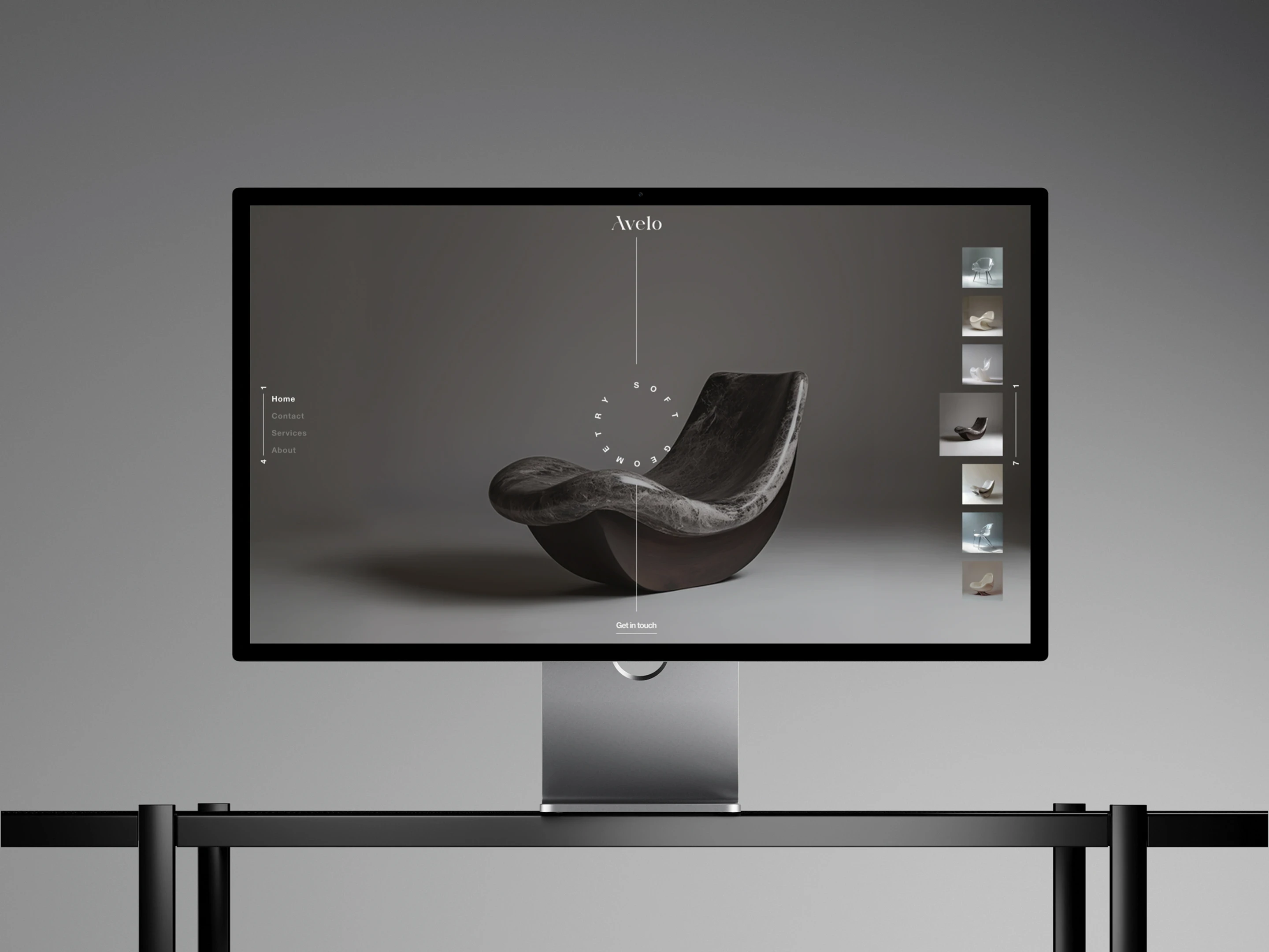
The page is built to give the image as much room as possible. A minimal navigation sits at the edges instead of across the top, keeping the centre open and allowing the full-screen imagery to extend naturally into the corners. The curved text was added as an art-direction element that echoes the organic shapes of the furniture, while the central vertical line brings symmetry back into a composition that is otherwise weighted to the left and right. The result keeps the interface quiet so the product can remain the main focus.
Typography
Aerisa
Aa Bb Cc Dd Ee Ff Gg Hh Ii Jj Kk Ll Mm Nn Oo Pp Qq Rr Ss Tt Uu Vv Ww Xx Yy Zz 1234567890&#$€%@!?*
Helvetica Neue
Aa Bb Cc Dd Ee Ff Gg Hh Ii Jj Kk Ll Mm Nn Oo Pp Qq Rr Ss Tt Uu Vv Ww Xx Yy Zz 1234567890&#$€%@!?*
Color
#F0F0F0
#797775
Grid
Columns
8
Gutter
20 px
Margin
20 px