Style Guide
Visual Direction
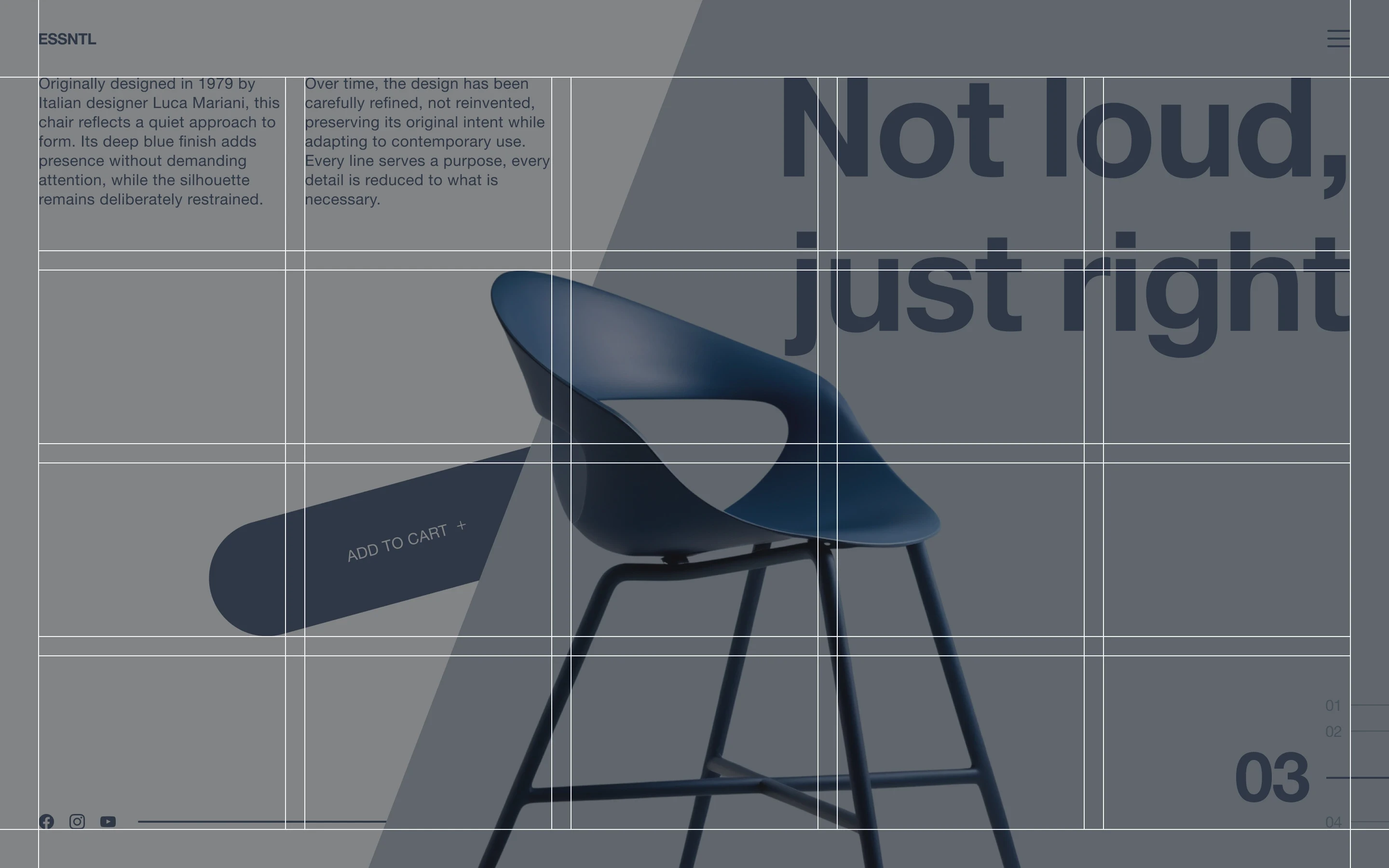
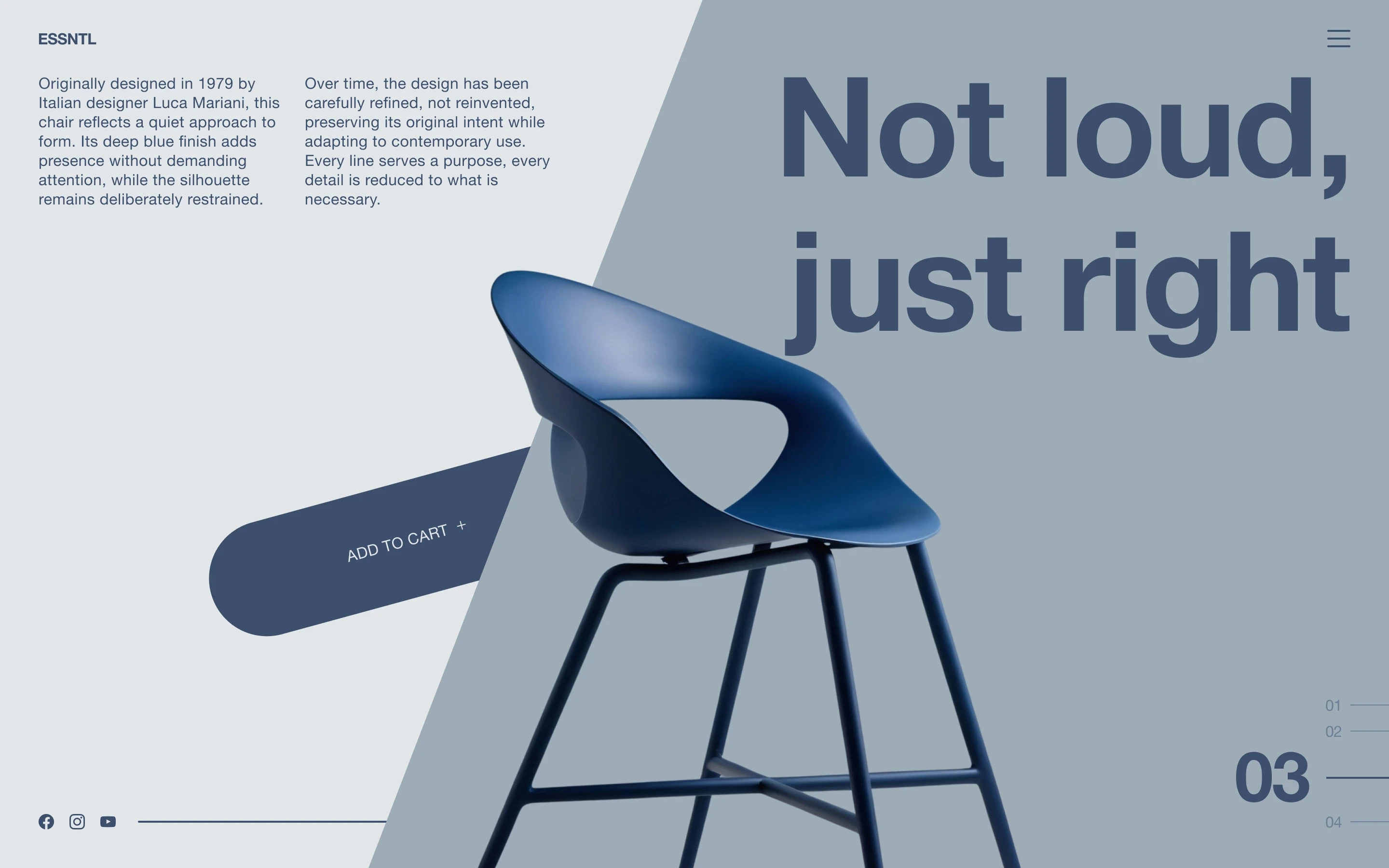
The chair is the clear centre of the page, with the rest of the layout built around it. The diagonal split adds movement, while the large headline gives the product a clear attitude without adding more visual elements. Keeping everything in the same blue and grey range ties the composition together and lets the unusual layout do most of the work.
Typography
Helvetica Neue
Aa Bb Cc Dd Ee Ff Gg Hh Ii Jj Kk Ll Mm Nn Oo Pp Qq Rr Ss Tt Uu Vv Ww Xx Yy Zz 1234567890&#$€%@!?*
Color
#3D4F6D
#9EACB8
#E2E6E9
Grid
Columns
5 x 4
Gutter
20 px
Margin
40 px